 |
| A cold, composite landscape creation |
Read on for some info about choosing and blending your images.
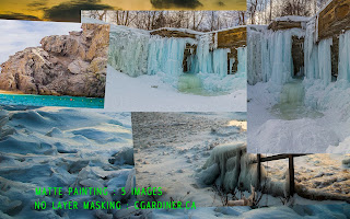
The base image was captured January 2015 at the shore of Lake Huron one blisteringly cold sunset. That is also the same day I shot the handrail component. The waterfalls are Indian Falls in Owen Sound, and just for irony's sake, I used a photo of the rocks surrounding Lover's Beach in Cabo San Lucas, Mexico to end the wall of icy waterfalls in my composite.
 |
| all of the components, in their original white balances, and un masked edges |
Choose the Component Images
There is an amount of consideration you should put into choosing your images, and a few things to remember. For example ; its easier to blend colour than it is to blend texture. So Even though the "Snows" weren't the same, what was important is that they had the same iced over, shapely surface. Also, consider the perspective of each image when placing it. Ask yourself a few things about each component before it goes into the design 1) where am I viewing this from (below the element, above the element or level with the element? You should make sure you answer that question the same way when it is in your final design. Nothing is more of a dead giveaway to poor photoshop work than mis-matched perspectives. It can't happen it reality so our eyes and our minds are very good at spotting it.Take the handrail, in the original photo it sat in the bottom left corner and was below the viewer, so I had to repeat that placement relative to the viewer in my composite, and same goes for the waterfalls and their placement.
Match the White Balances
So especially with bringing the Mexico rock into the situation, there were a lot of white balances to work with. If your white balances don't match, they will emphasize the lines between one component and another. So thats where the blending comes in. I used a individual levels adjustments, working on each the Red, Green and Blue channels separately to match each RGB channel of one component with the channels of the components near it. Lastly, I used a blue gradient over the yellow sunset sky to cool it down a bit, and then rendered a 'sun flare' from photoshop into the left hand corner. - It's a moderately realistic sun placement for the scene but it serves to hide the line between the 'Mexico rocks' and the rest of the central Ontario, Canada landscape.Blend the Layer Masks
 |
| the components of a composite landscape before white balancing, but after the layer masks have been blended. |
After that the hard stuff is done. All that is left is some finishing touches. Give it some sharpening, maybe apply a global filter effect to help unify it if it still looks 'patchy', but at this point you can treat it like a regular photo to edit.
and thats the gist of it. I'm looking forward to make and sharing more of these and further developing my technique.
1. Consider perspective and focal length of your a) intended finished image, and b) the components you use
2) Blend and position the layers to see the general layout of your vision
3) Blend the white balances
4) Finishing touches.
Enjoy and thanks for reading,
 |
| the final version of a composited landscape following the general outline above. |